A unique challenge for me, when the lead designer and I pitched our concepts to the team. Her idea got picked and from there I took on the full supporting UX/UI designer role. After the lead designer set the look and feel, I create custom assets for the design system, and internal interactive web block components in another designer’s style.
Even though the design system, and pages were created by two different people, the site as a whole needs to look seamless and cohesive. This took good communication and dedicated teamwork.
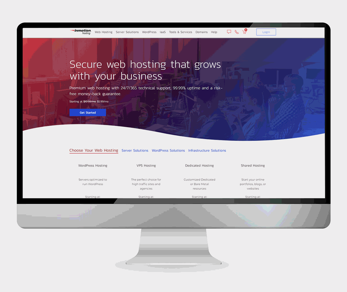
 Launched design of the IMH home page
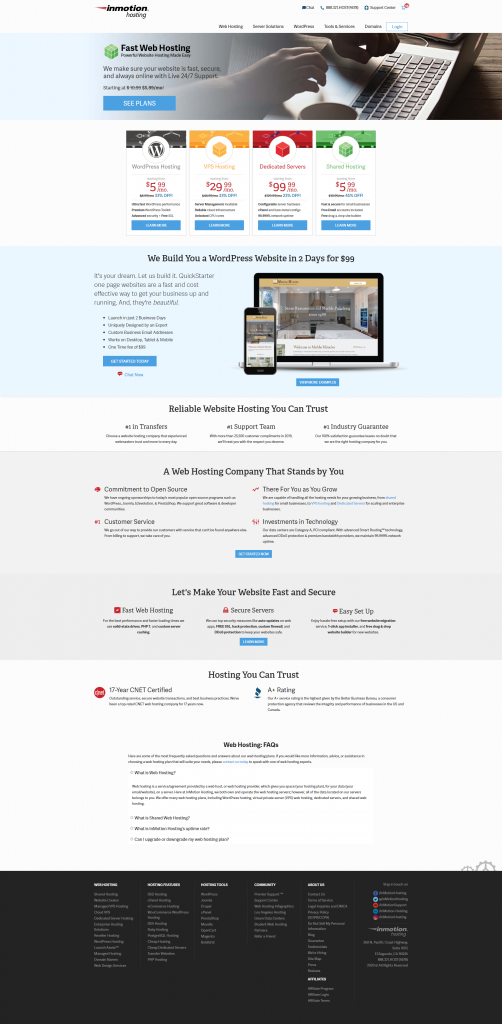 Website design before the redesign.
 The old version of the spec table was very long and cumbersome to wade through. It felt chaotic, with badges loudly calling for your attention, and a wall of check icons. This layout did not make it easy to compare features, especially when more products would be added.
 This wire frame is what initially proposed to the team as a new way of laying out the spec table information. Features included in all plans organized together at the bottom and grouped by category. This approach saves us a lot more website real estate.
 As the design style guide evolved, a few changes to the overall look came about like the way we would represent tool tips with a dotted underline of the key word, rather than a clickable icon next to the feature.